Logo restyling and rebranding. Labelled packaging design.
The tools
Photoshop
Illustrator
InDesign
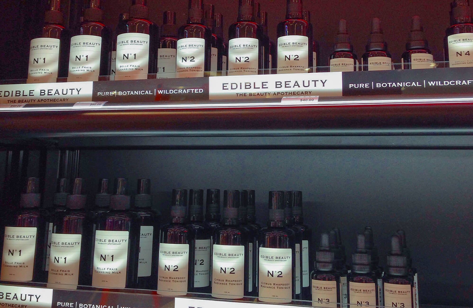
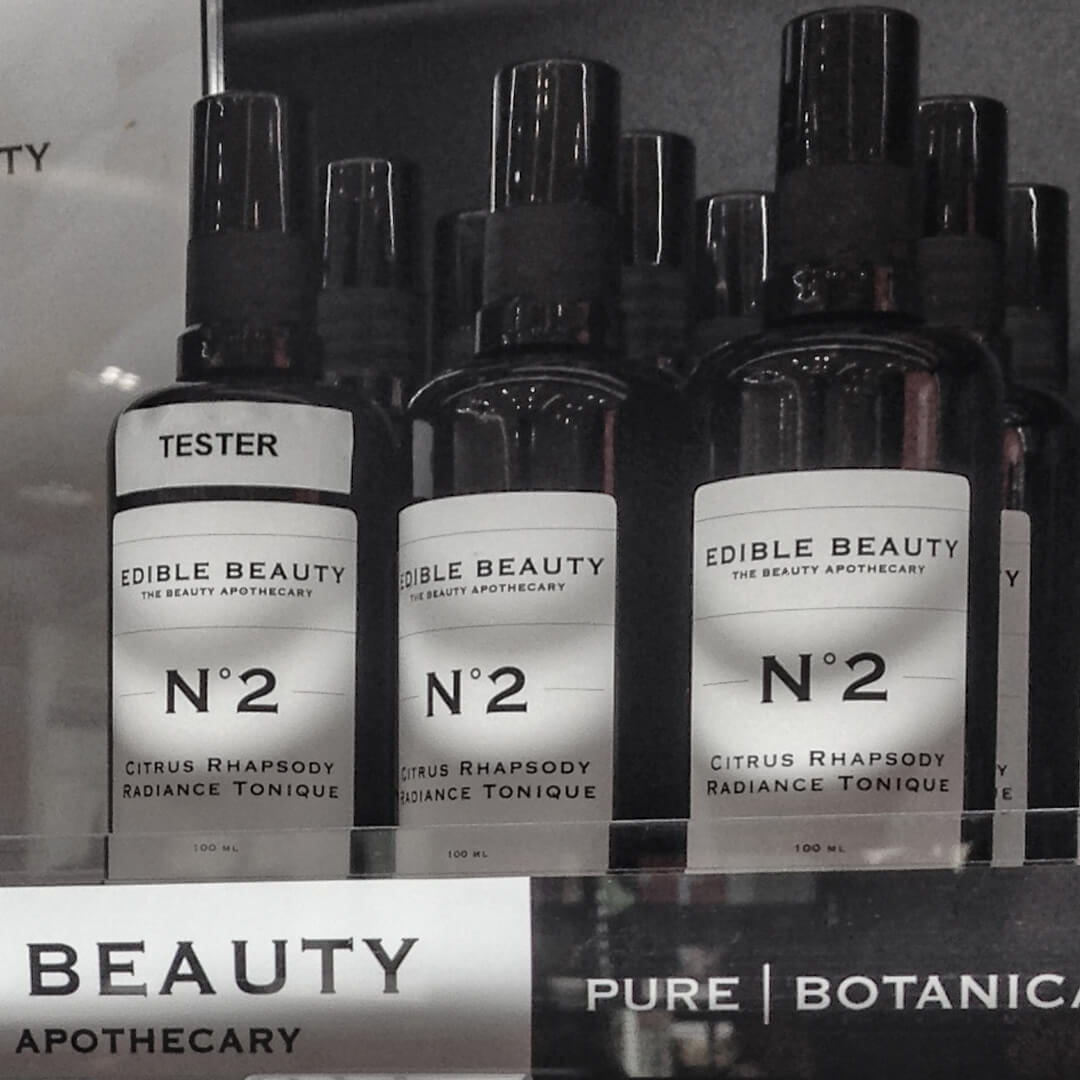
Edible Beauty, in 2014, went for a complete rebranding based on a whole new logo designed by me.
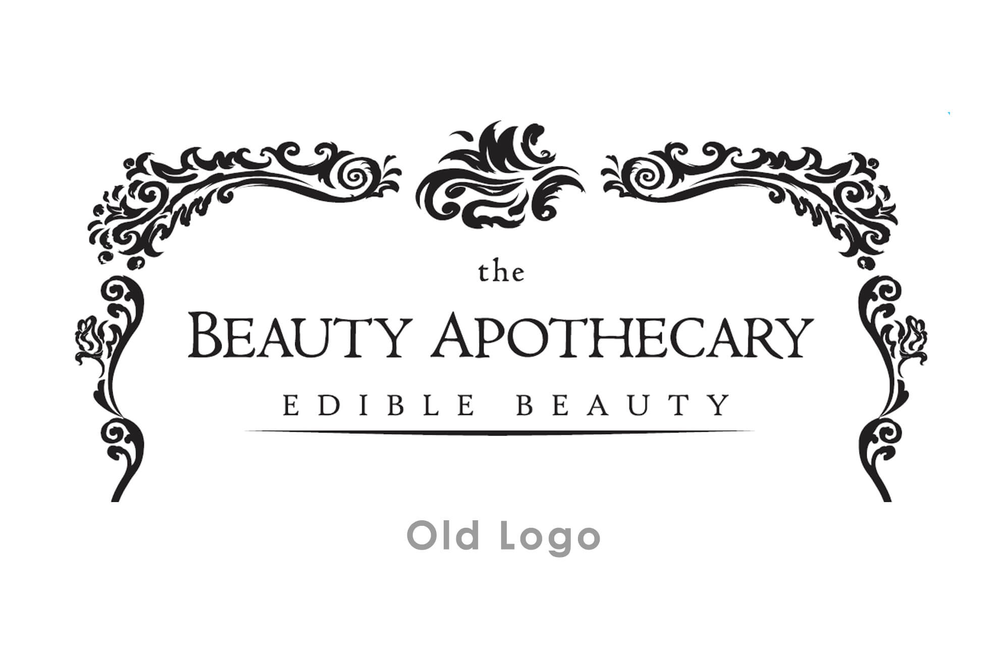
Departing from the old Liberty-styled logo, the client asked for a cleaner, more elegant appearance.
Framed in a very thin grey line, in place of the leafy canopy, a Copperplate variant based logotype. Simple, clean, authoritative, yet with old-fashioned beauty in its peculiarities, carrying on the prestige conveyed through its former glyphs and serifs.
Labels design had then followed, for different supports and packagings (jars, tea bags, sprayers).


 swipe up